


4 min read
AI Design Slop: Why AI-Generated UI Looks Generic — and the Fix
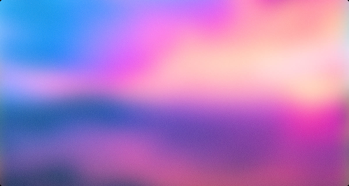
AI coding agents ship the same purple gradients, glassmorphism, and identical card grids. Here's why AI-generated UI looks like slop — and how a closed-loop design-quality bar fixes it for good.
Read